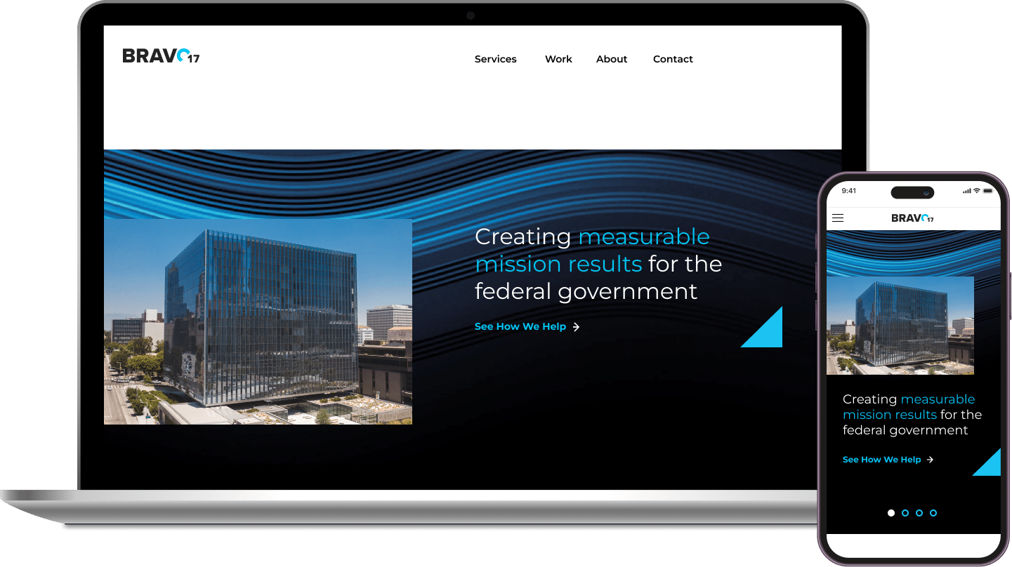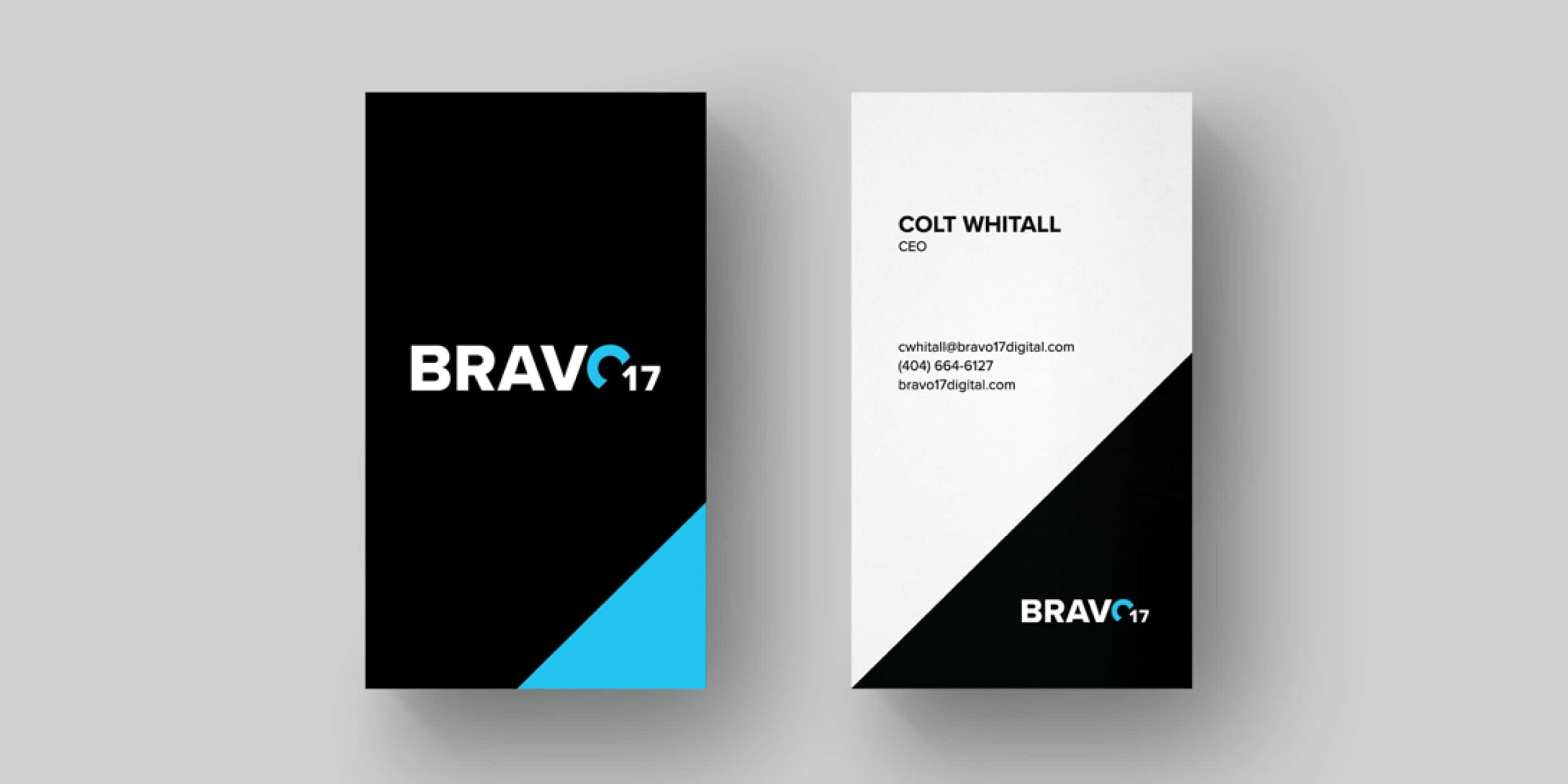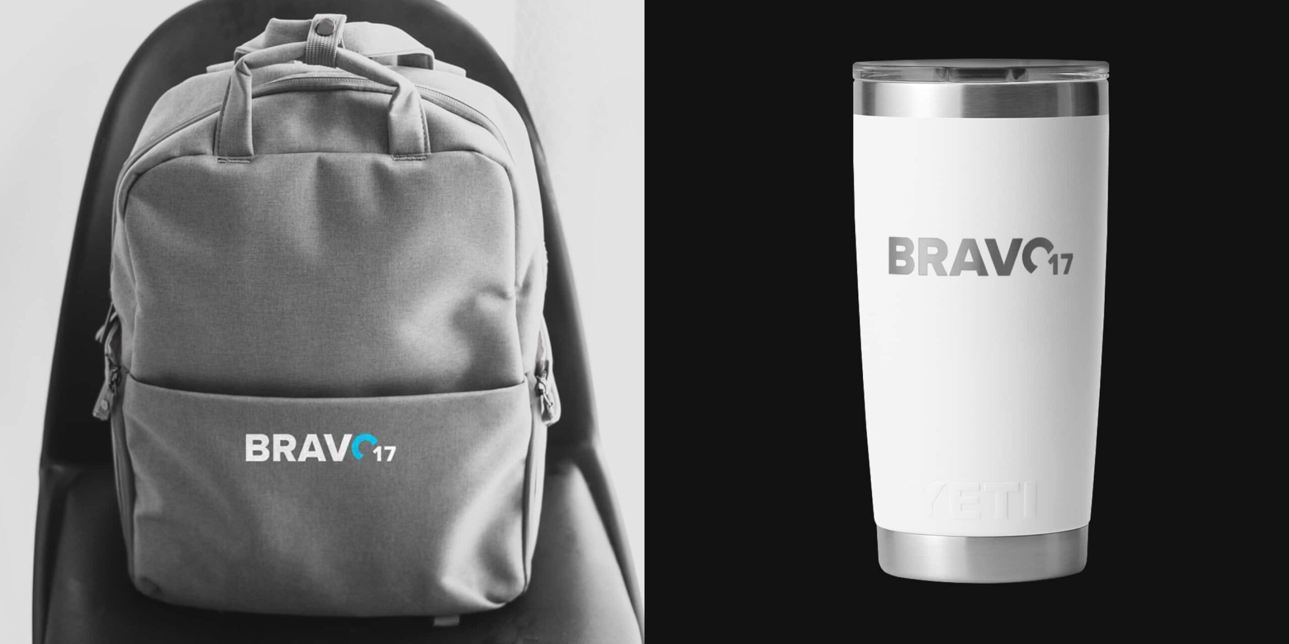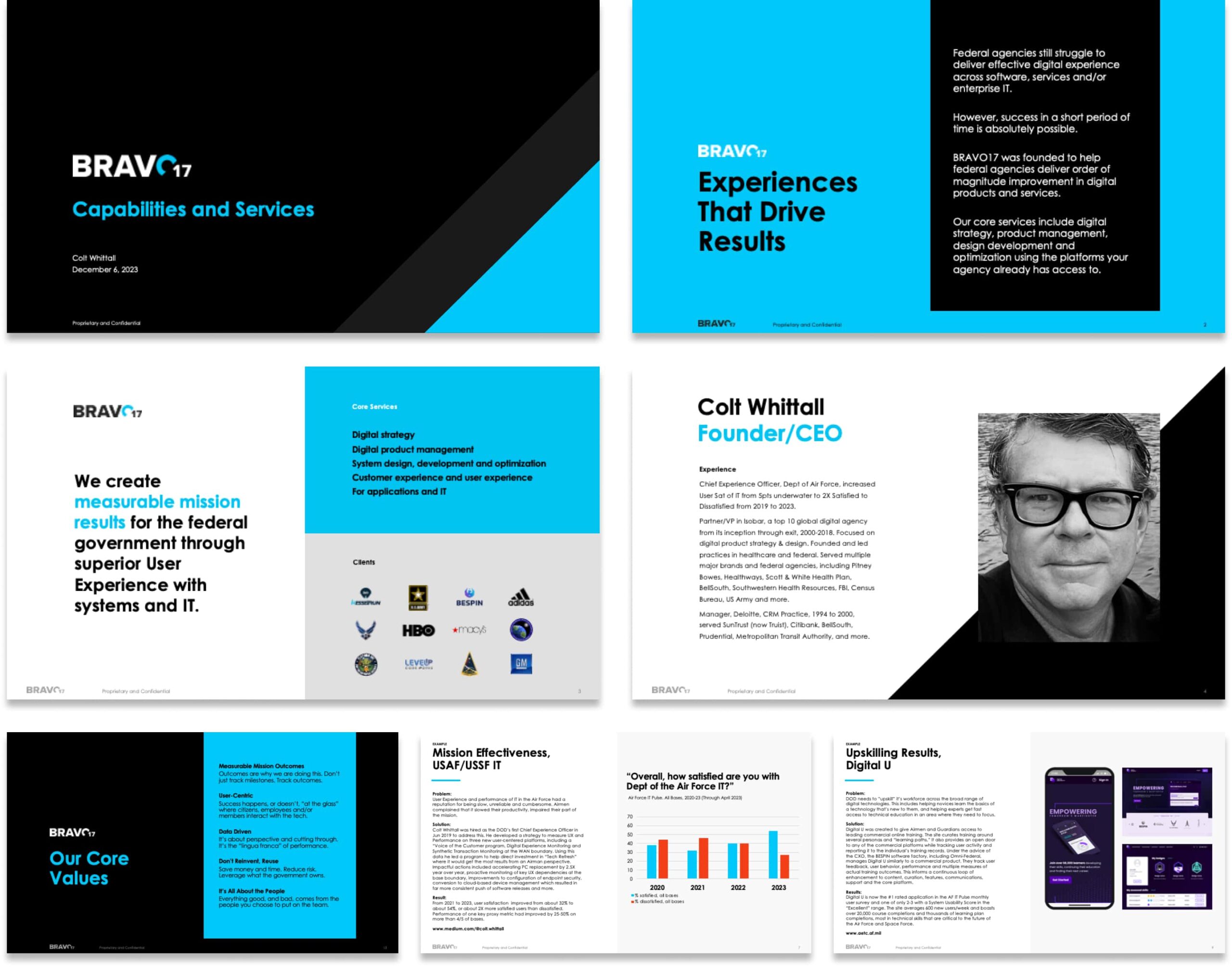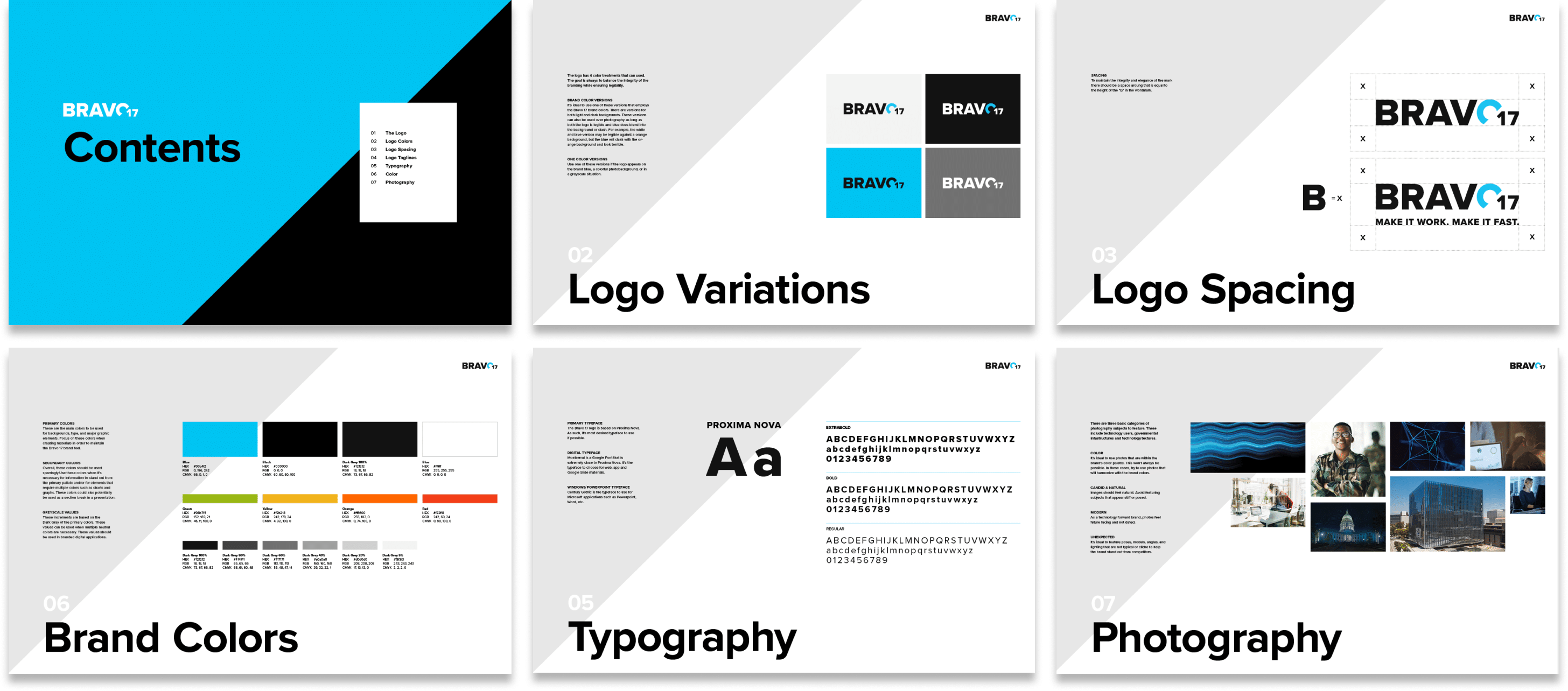
Bravo 17 is a digital consultancy focused on creating measurable results for the Federal Government through superior user experience. The challenge was to create a branding system that represents their proficiencies across digital strategy, UX, digital products and system design.
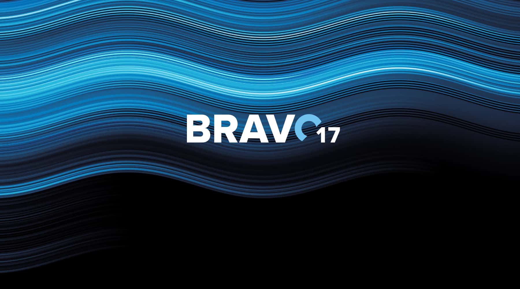
The solution is a simple mark that instills a sense of confidence. The “o” is highlighted to symbolize their commitment to human-centered design. It evokes the notion of a circular chart alluding to the measurable results the brand delivers. The color palette is bold to cut through the noise of a crowded competitor space.
Example outputs of this project include:
Logo and Identity System
Client Presentation Deck
Branded Promotional Items
Brand Guidelines